The project
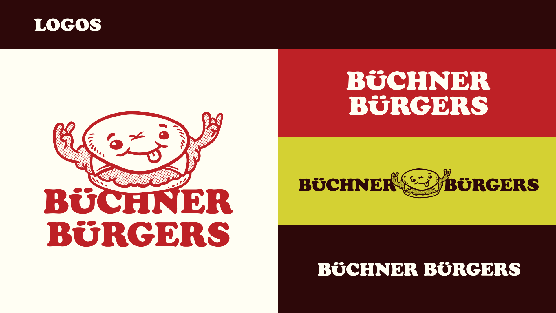
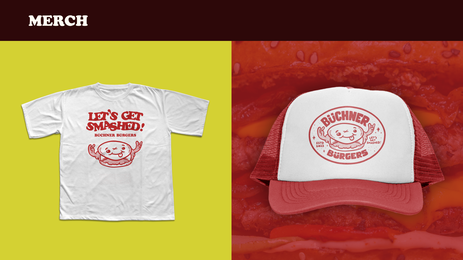
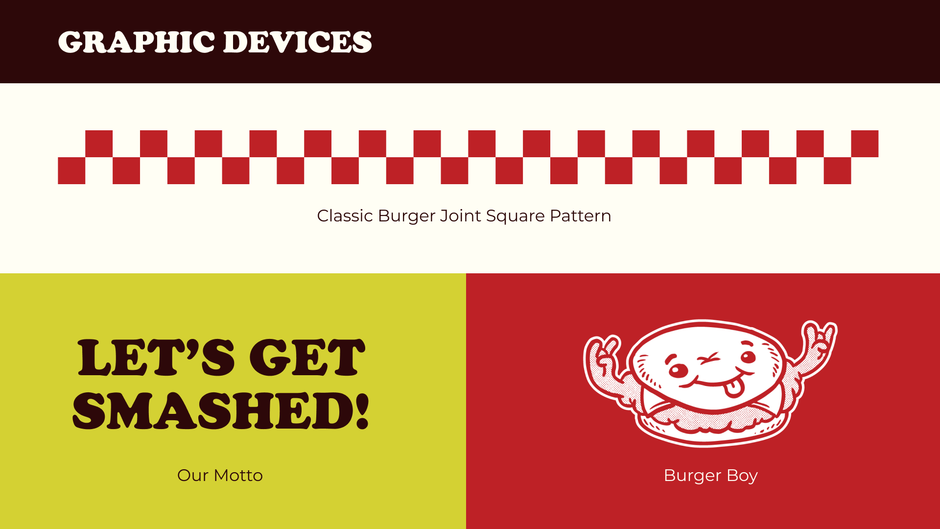
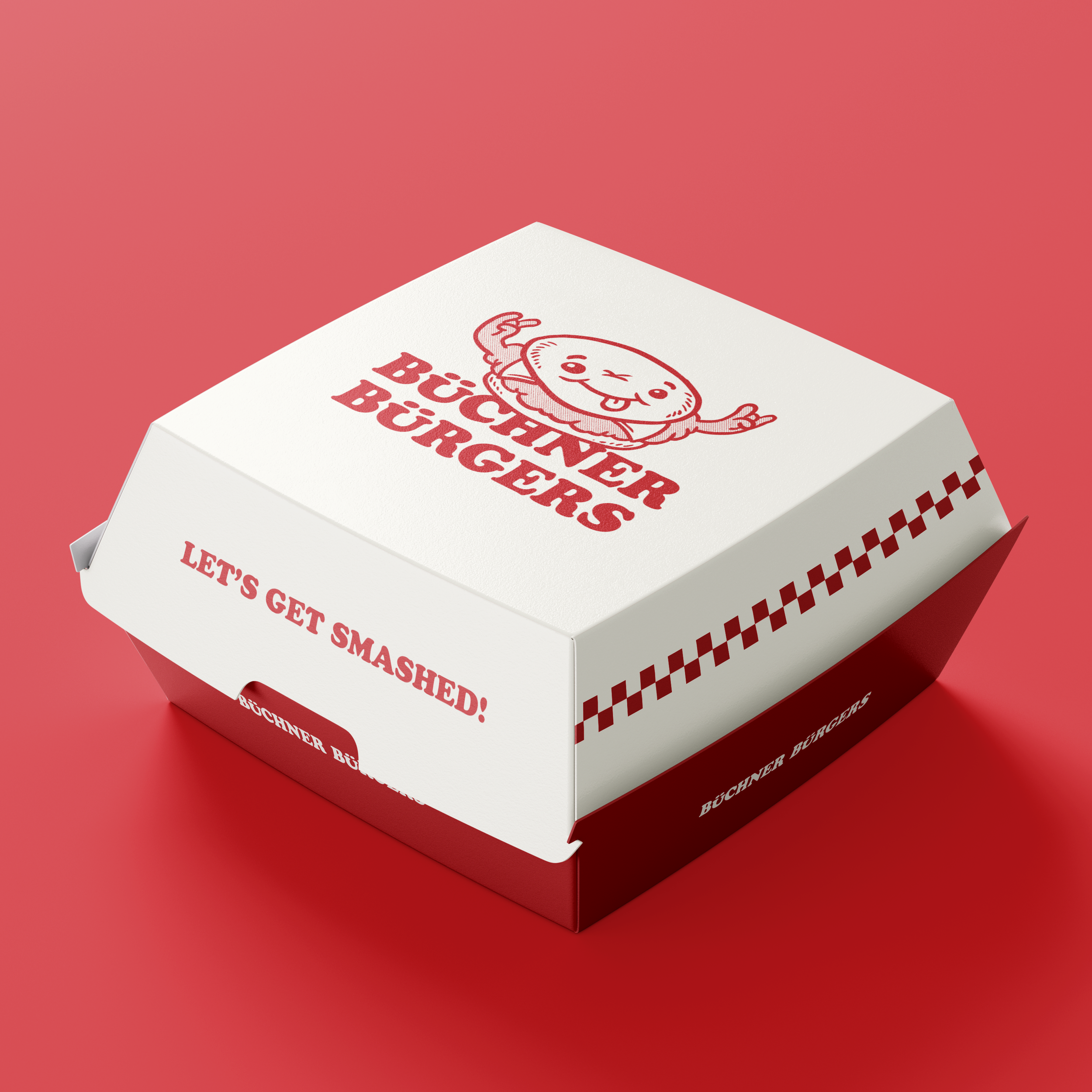
Burgers don't get any more rock 'n' roll than this! Innes Büchner, the owner, is a big ol' rocker and wanted something that reflects his passion for heavy music with a 50s diner twist. So naturally, we had to use the umlaut (of Motörhead fame) in the word 'Burgers,' as it was already present in his (very German) surname.
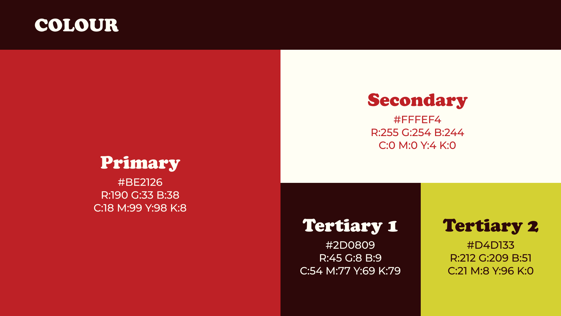
As is tradition in diner-style graphics, we landed on red and off-white as the primary and secondary colours. Mustard (representing cheese, of course) was chosen as a tertiary colour, and to round off the German theme, we chose an off-black (AKA very dark brown).
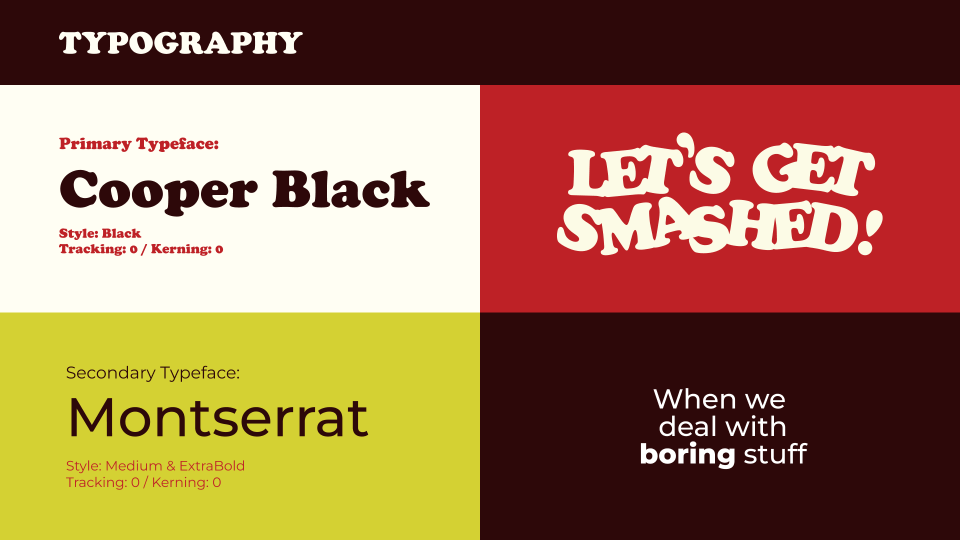
The tagline 'Let's get smashed!' was very apt as the pop-up's foray into the world was at a bar. Hopefully this double entendre is not only understood by the barflies and boozehounds reading this.
The creative